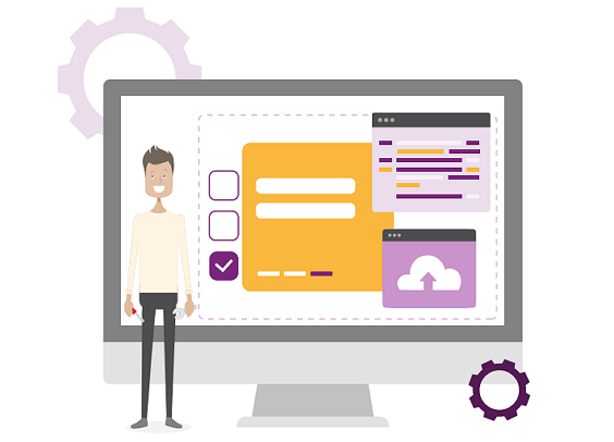
Easily Copy your Customised Home Pages
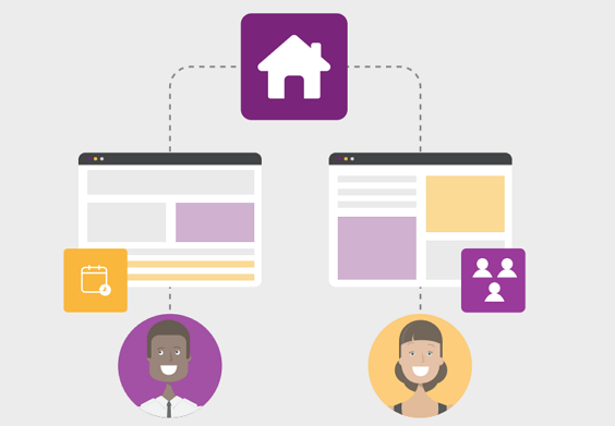
We are thrilled to unveil our latest enhancement: the Copy Home Page Tab feature designed to transform the way you work with your Customised Home Pages. Whether you’re a project manager executing projects for multiple departments or portfolios, a team member with dashboard views per project, or a PPO administrator duplicating views for multiple user groups, our new Copy Home Page Tab feature is here to help you discover a faster and easier way to copy your customised views.