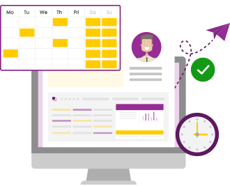
What’s New in PPO’s Scheduler
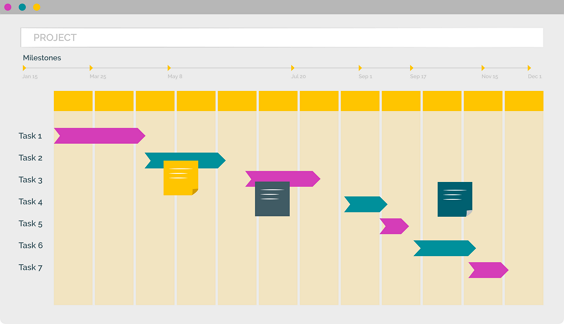
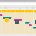
We’ve rolled out a series of powerful enhancements to PPO’s Scheduler, including visual dependency arrows, colour-coded bars and milestones, support for lead and lag, column header wrapping, inclusive end dates for milestones, and more. These updates bring greater consistency across task pages and improved usability for project teams.