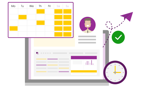
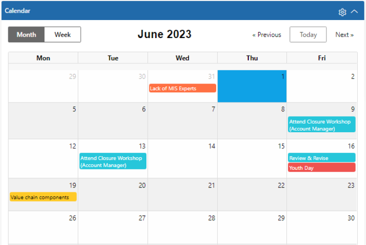
Quickly check when items were Last Updated!
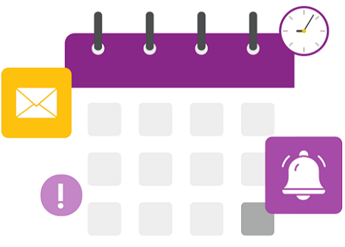
We recently deployed the ability to use date fields for filtering on list pages in PPO by using various pre-defined date filters. We have now further enhanced this feature to allow the ability for you to see when last something was updated in PPO by using the Last Updated date field!