So far, we’ve brought you the My List, Calendar, Key Metric, Donut & Bar Chart widgets and at the start of the next quarter, you can expect to see these widgets on your new Configurable PPO Home Page. While you can still make use of lists on your home page the new Configurable PPO Home Page now allows each user to configure their own home pages (yes, multiple!) to allow for their own personal PPO Dashboard on your home page!
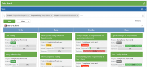
We’ll also be introducing Board Views that’ll be made available on all list pages for all entities. We’ve allowed users to apply a Group By, specify the fields visible on each card and configure their own workflow statuses, e.g. New, To Do, Doing or Done. Even better, you can visualise work by status without switching to dashboards, and you can do it for Projects, Tasks, Work Items, Risks, Issues etc.

Let’s be honest, the missing ingredient in PPO’s dashboards has been the lack of interactivity, drill-through and click-through. We’ve been listening closely to feedback from you and the most common request is to apply the same interactivity available on the charts on list pages to the dashboards. We’re excited to share our latest wins when it comes to our dashboards. You can look forward to:
- New chart types – Keep an eye out for the addition of activity rings and gauges.
- More modern look and feel – Key metrics are now consistent on both list pages and dashboards.
- Drill-throughs and Click-throughs – Drill down into the details with just one click.
Missed the webinar featuring Board Views, Interactive Dashboards and Configurable Home Page? Watch the recording here.


