Hot on the heels of our fancy new filter control on list pages, we are pleased to introduce our latest change. As a PPO user you will be very familiar with the universal action icons that are a standard fixture on most PPO pages.
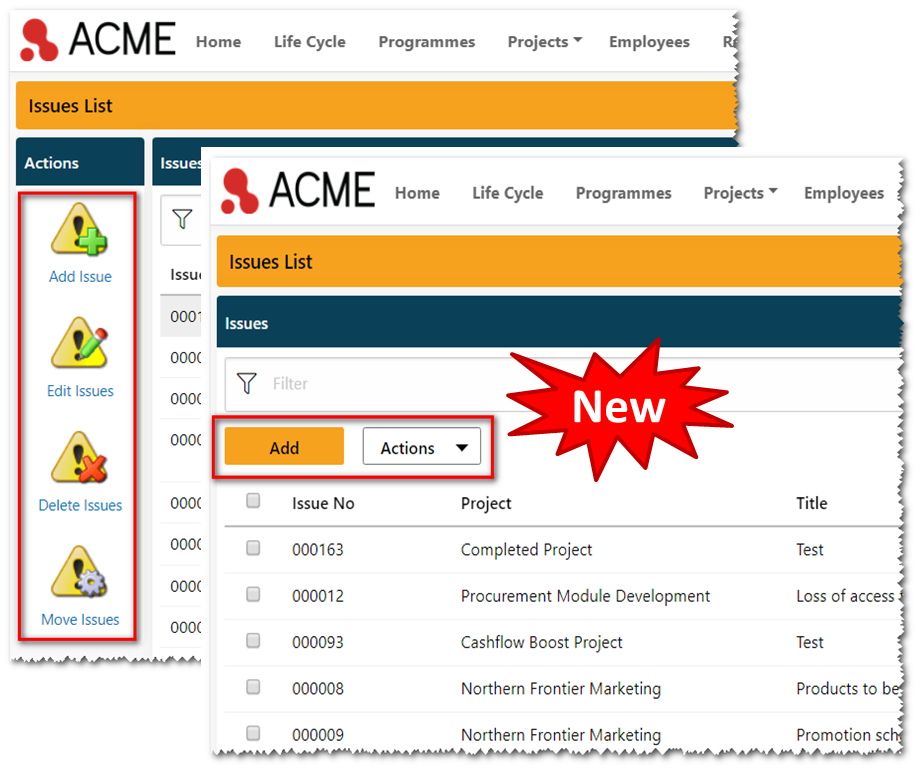
As part of our initiative to modernise and improve the PPO user interface we are saying goodbye to the action icons and introducing a sleek and clean new look. Replacing the action icons are action buttons and action menus as shown in the screenshot below.
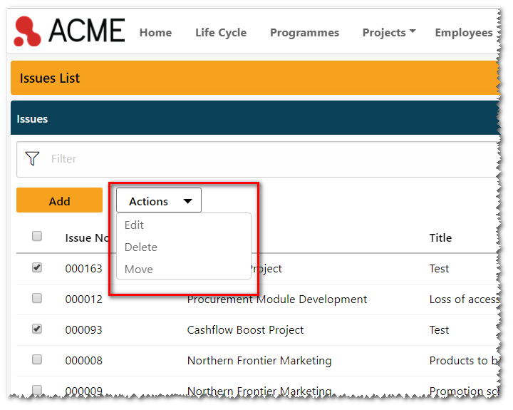
 You will notice that the primary action on each page has its own button, while secondary actions are combined into an actions menu that sits alongside the primary action button. When you click on the Actions button you will see the additional options that are available.

You will also notice that there is a new column on the left containing check-boxes. These work in conjunction with the secondary actions. So for example, if you want to delete several items, simply select them and then click on the Delete menu item in the secondary actions menu. The same applies if you want to edit or move the selected items to a different project. If you want to select all the items on the page, simply click on the checkbox at the top of the column.
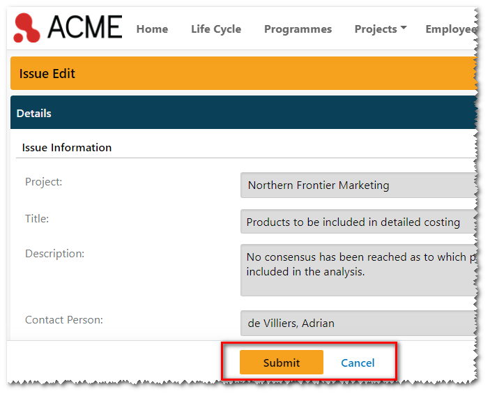
When adding or editing an item, you will also notice that the old Submit and Cancel action icons have now been replaced by buttons at the bottom of the page.

One nice bonus of the new buttons is that they “float” at the bottom of the page, meaning that you no longer have to scroll back to the top of the page in order to submit an item.
We hope that you like the new change and as always, you can keep up with the latest PPO features on our timeline. Have ideas for more improvements we can make? Drop us a note or log an idea to share yours.


