When we announced our official launch of the PPO ‘User Interface (UI) Facelift’ project, we shared a few details on what users can expect. Today the first of those changes are available! We’ve rolled out multiple changes to the PPO user interface, which we hope you’ll agree not only looks nicer, but also makes PPO even easier to use.
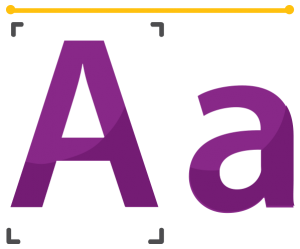
New font
The standard fonts in PPO have changed to crisp new modern varieties that are not only easier on the eye but are also more uniform across different devices. The specific font that you will see will depend on your device i.e. on Windows it is Segoe, on Macs it is Helvetica Neue and Roboto on Android.

Table layouts
We’ve changed how we lay out tables in PPO to avoid horizontal scrolling and to better handle very long free text fields.
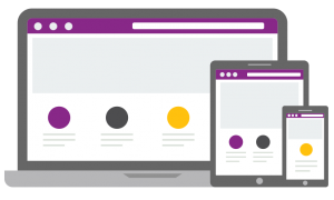
Reactive screen layout
The journey of making PPO more reactive to the specific screen size and dimensions has started! You will see that PPO looks significantly different on phones vs on a large monitor, showing the content in a way that is appropriate for the screen dimensions. Lots of changes related to this are still to come so keep an eye out for these.
Improved multiple edit
We’ve also made a few tweaks on the multiple edit pages in terms of the row and column sizing. You will notice that the rows / columns no longer resize when you click on an item to make a change which result in less “jumping” around and overall a more pleasant experience.
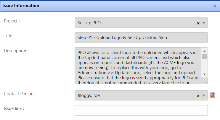
Consistent input controls
Input controls have been standardised and tweaked in terms of their appearance and layout to make it easier to capture information and resulting in a more aesthetically pleasing experience.

More to come
We’re still continuously learning from you so please write to us at any time, support@go2ppo.com and let us know what you think. We thank you for staying with us on this journey to making PPO even better for you!


