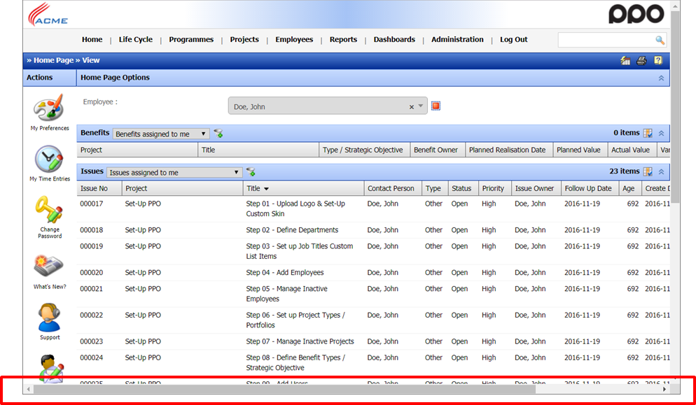
One of my pet peeves is when I have to scroll from left to right in order to see all the columns on my home page or on a list page. Vertical scrolling on the other hand is usually not a problem since today most of us use a mouse with a scroll wheel which makes this a breeze. However in order to scroll from left to right, you have to go to the scroll bar and then click, which sort of breaks your flow of work.

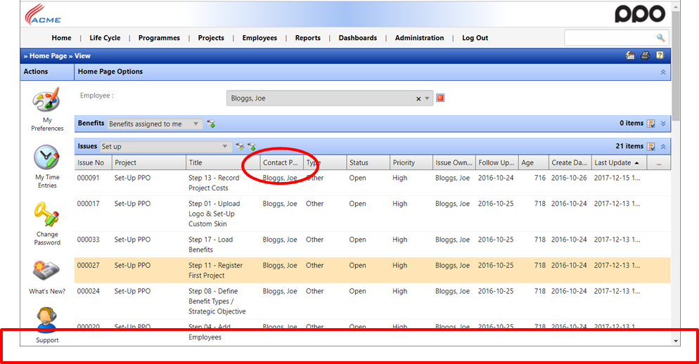
I am therefore pleased to announce that we have tweaked all lists in PPO to avoid scrolling entirely as shown below.

As you can see, there is no longer a horizontal scroll bar, even if you make your window smaller! It should however be noted that this does come with some compromises – you will for example notice that the column headers, like the “Contact Person” in the above example is contracted to “Contact P..”. You can however just mouse over the heading to see the full caption.
You will also notice that the contents may start contracting, like the “Last Update” field in the example above. You may also notice that we now only show the first 6 lines of content for free-text fields.
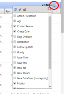
The best way to keep your lists readable is to make sure that you are only showing the columns that you really need. You can easily add or remove columns by clicking on the column selector at the top right of the list and selecting / de-selecting the columns to be shown.

As always, if you have questions or comments, we’re here to help!


